Logo Typography for Businesses in Hyderabad
How to Choose the Right Font for Your Brand
A business logo can have a powerful symbol and an attractive color palette, but poor typography can still make the identity look unprofessional. The shape of every letter, the spacing between characters, the weight of the typeface and the relationship between the company name and symbol influence how customers perceive a brand. Understanding Logo Typography for Businesses in Hyderabad helps companies move beyond simply selecting an attractive font and develop typography that supports their personality, audience and practical applications. Designers Studio creates professional logo and brand identity systems for startups, established companies, manufacturers, retailers, real estate businesses, healthcare organisations and service providers across Hyderabad and Telangana.
Why Does Typography Matter in Logo Design?
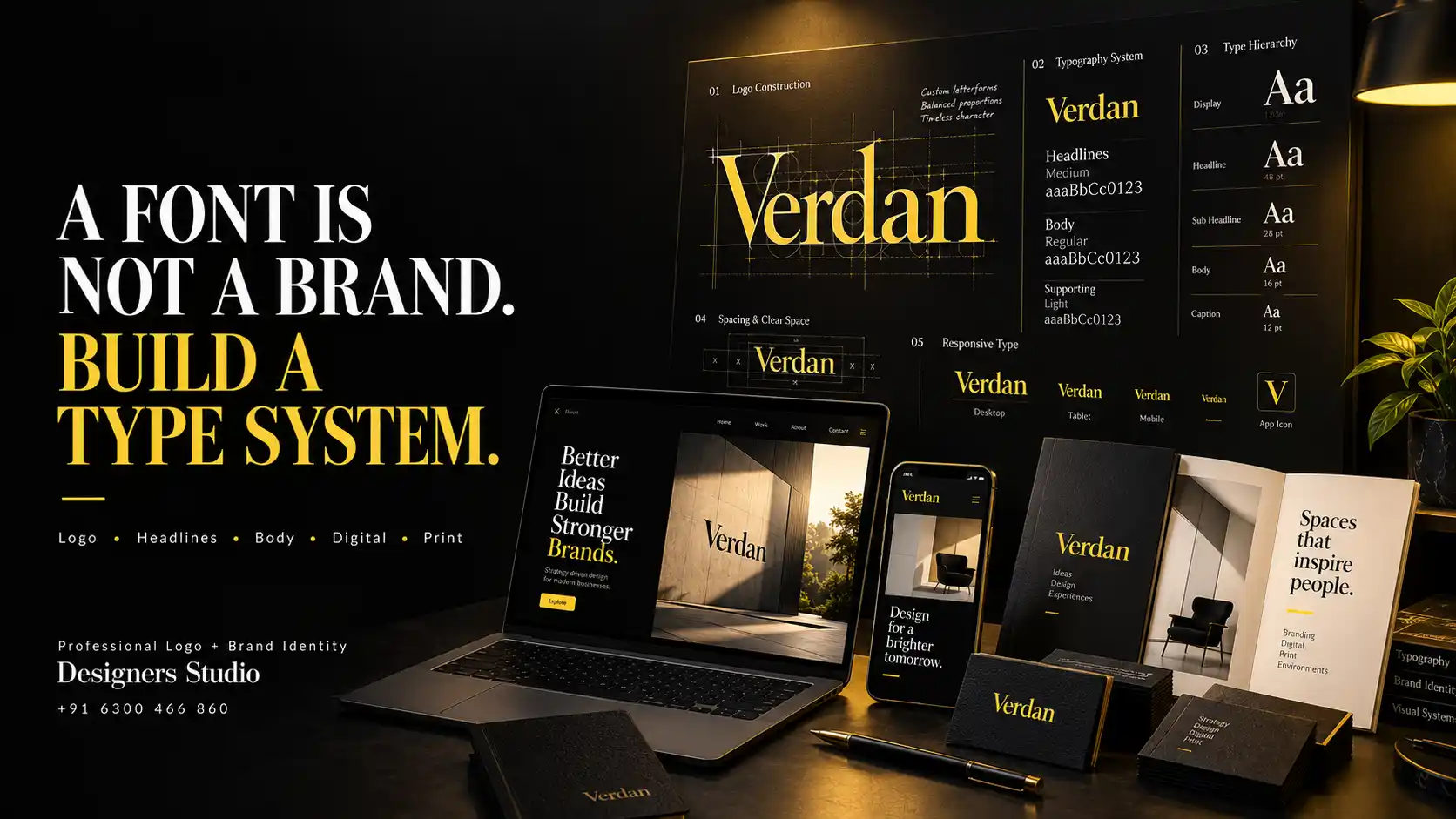
Typography is not simply the text placed beside a logo symbol.
For many businesses, the company name itself becomes one of the most recognisable elements of the identity.
Letterforms can communicate very different personalities. Typography can appear traditional, technical, approachable, premium, expressive, minimal or authoritative depending on how it is designed and used.
Typography Logo Design Hyderabad should therefore consider what the business wants customers to perceive rather than selecting a font only because it looks attractive.
Typography also influences practical performance. A company name must remain readable across websites, business cards, packaging, signage, social media and other important applications.
Font vs Typeface: What Is the Difference?
The words font and typeface are frequently used interchangeably in everyday communication.
A typeface generally refers to the overall design family of the letterforms, while a font traditionally refers to a particular style, weight or implementation within that family.
For business owners, the more important point is understanding that selecting typography involves more than choosing a name from a font menu.
The designer may adjust weight, spacing, individual characters and proportions to make the typography more suitable for the identity.
In some projects, existing typography can provide the foundation. In others, custom lettering may create a more distinctive result.
1. Serif Typography in Logo Design
Serif typefaces contain small finishing strokes or structural details at the ends of letterforms.
Depending on the specific design, serif typography can communicate heritage, sophistication, authority, editorial character or craftsmanship.
Serifs can work effectively for professional services, hospitality, fashion, premium products, educational institutions and businesses seeking a more established personality.
However, not every serif typeface feels traditional.
Contemporary serif families can appear modern and expressive when combined with suitable spacing, proportions and supporting visual elements.
The specific typeface matters more than the broad category alone.
2. Sans Serif Typography in Logo Design
Sans serif typefaces remove the traditional serif finishing strokes and often create cleaner letterforms.
They are widely used across technology, corporate services, healthcare, startups, retail and modern consumer brands.
A geometric sans serif can feel precise and structured. A humanist sans serif may appear warmer and more approachable. A condensed sans serif can create strength and efficiency.
This means selecting a sans serif font does not automatically make a logo modern.
Logo Fonts Hyderabad should be evaluated according to the actual shape and personality of the letterforms rather than broad font classifications alone.
3. Script and Hand Lettered Typography
Script typography can introduce personality, elegance, movement or a handmade quality.
It may be suitable for selected beauty, hospitality, food, fashion, wedding, personal or artisan brands.
Readability requires particular attention.
Highly decorative scripts may look attractive at large sizes but become difficult to recognise when reduced for social media, packaging or mobile applications.
Script typography should also match the actual character of the business rather than being used simply to make the identity appear luxurious.
4. Display Typography
Display typefaces are designed to create strong visual character and are generally intended for larger sizes.
They can use unusual proportions, distinctive geometry or expressive letterforms that make the company name memorable.
Display typography can be useful when a business wants a bold and recognisable personality.
However, highly stylised type should be evaluated carefully for readability and longevity.
An identity that depends heavily on a temporary typography trend can begin to feel outdated quickly.
5. Custom Lettering and Modified Typography
Businesses do not always need a completely custom alphabet to create distinctive logo typography.
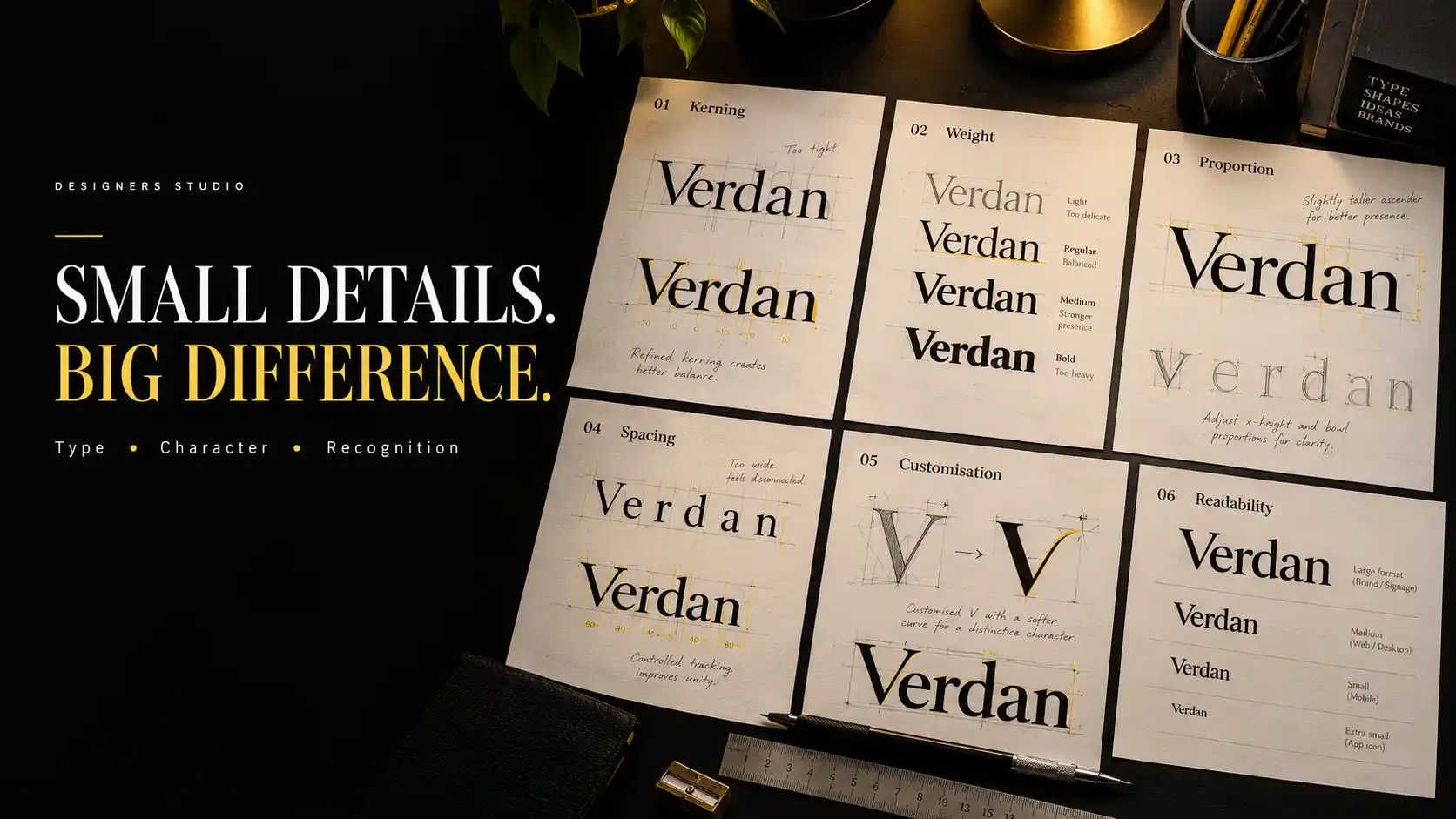
A professional designer can sometimes begin with an appropriate typeface and modify selected characters, terminals, proportions or spacing.
These modifications can make the company name more ownable while maintaining readability.
In other cases, fully custom lettering may be appropriate when typography is the primary identity element.
Custom Logo Design Hyderabad can use specially constructed letterforms to create visual characteristics that are difficult to achieve through an unchanged standard font.
Customisation should have a purpose. Changing letters unnecessarily can reduce readability rather than improve distinction.
Match Typography With Brand Personality
Before choosing typography, businesses should define how they want the brand to feel.
A premium property company may require a different typographic personality from a children’s education business.
A technology startup may want clarity and innovation, while an established manufacturer may prioritise confidence, precision and durability.
The selected typography should support these characteristics without relying on stereotypes.
Competitor analysis can also reveal which typography styles are overused within the category.
This can help the business remain appropriate while creating stronger differentiation.
Prioritise Logo Readability
A distinctive company name is not useful if customers cannot read it.
Typography should be evaluated at the sizes customers will actually encounter.
Thin strokes may disappear on small screens. Closely spaced letters can merge. Decorative details can become unclear when printed at small sizes.
A logo that works beautifully on a large presentation screen should also be tested on business cards, mobile screens and social media profiles.
Readability does not require every identity to use plain typography. It requires balancing character with clarity.
Kerning, Tracking and Letter Spacing in Logo Design
Spacing is one of the most important details in professional logo typography.
Kerning refers to adjusting the space between individual pairs of letters.
Tracking refers more broadly to spacing across a group of characters.
Automatic font spacing is designed for general typesetting and may not always create the ideal visual balance for a logo.
For example, combinations such as A and V or T and O can require individual attention because of their shapes.
Professional logo development evaluates optical balance rather than relying entirely on mathematically equal spaces.
Typography and Logo Proportions
The company name should feel visually balanced with the rest of the identity.
If a symbol is extremely large and the business name is too small, the relationship may feel disconnected.
If the typography dominates an identity intended to emphasise a symbol, the hierarchy may become unclear.
Proportions should be tested across different configurations.
A horizontal arrangement may require one relationship between symbol and typography, while a stacked configuration may require another.
The objective is to maintain visual consistency without forcing exactly the same proportions into every format.
How Should Typography Work With a Logo Symbol?
A symbol and wordmark should feel like parts of one identity rather than separate graphics placed beside each other.
Shape characteristics can help create this relationship.
A geometric symbol may pair naturally with structured typography. A softer organic symbol may benefit from letterforms with complementary curves.
This does not mean the typography needs to imitate the symbol literally.
Contrast can sometimes create a stronger identity when it is controlled intentionally.
Spacing between the symbol and wordmark is also important and should be defined consistently across approved configurations.
Test Logo Typography Across Different Sizes
Modern identities need to work in environments ranging from large signage to small mobile interfaces.
A detailed wordmark may perform well at large sizes but become difficult to read as a small profile image.
Responsive logo systems can address this problem.
The complete company name may be used in primary communication while a compact symbol, monogram or simplified configuration supports smaller spaces.
Professional Logo Design Hyderabad should anticipate these requirements before the identity is finalised.
Logo Typeface vs Brand Typography: Are They the Same?
The typography used in a logo does not necessarily need to become the typeface used throughout every piece of communication.
A distinctive logo may use custom lettering that would be unsuitable for paragraphs, websites or presentations.
A broader brand typography system can therefore include complementary typefaces for headlines, subheadings and body copy.
The objective is visual compatibility rather than complete repetition.
Brand Typography Hyderabad can define a hierarchy that keeps websites, brochures, presentations and social media visually connected to the logo while remaining practical for longer communication.
Common Logo Typography Mistakes Businesses Should Avoid
One common mistake is selecting a typeface simply because it is currently popular.
Another is using several unrelated fonts inside one logo in an attempt to create variety.
Businesses should also avoid excessive decorative typography that makes the company name difficult to read.
Poor kerning can make professional typefaces appear amateurish.
Extremely thin typography can create reproduction problems at small sizes.
Another mistake is stretching or compressing a font artificially to make it fit a particular space.
Businesses should also avoid choosing typography only after the symbol has been completed without considering how both elements will work together.
Finally, typography should not be evaluated only at presentation size. Real application testing is essential.
Our Logo Typography Process at Designers Studio
Designers Studio approaches typography as an important part of the identity rather than an element added after the symbol is complete.
Business Discovery
We understand the company’s audience, positioning, personality and practical communication requirements.
Typography Exploration
Relevant serif, sans serif, display, custom or other suitable directions are evaluated according to the identity concept.
Letterform Review
Individual characters are examined for visual character, readability and opportunities for suitable customisation.
Kerning and Spacing
Letter relationships are refined to improve optical balance.
Symbol Integration
When the identity includes a symbol, its proportions and spacing are developed in relation to the typography.
Size Testing
The logo is evaluated at large and small sizes to identify potential readability problems.
Application Testing
Suitable website, social media, print, packaging or signage applications are reviewed according to project requirements.
Typography System
Where the project includes a broader identity, supporting typography can be selected for headings, body copy and marketing communication.
Businesses developing a complete visual identity can combine logo creation with graphic designing services in Hyderabad, brochure design and printing services in Hyderabad, company profiles, packaging, social media creatives and website design.
Why Choose Designers Studio for Logo Typography in Hyderabad?
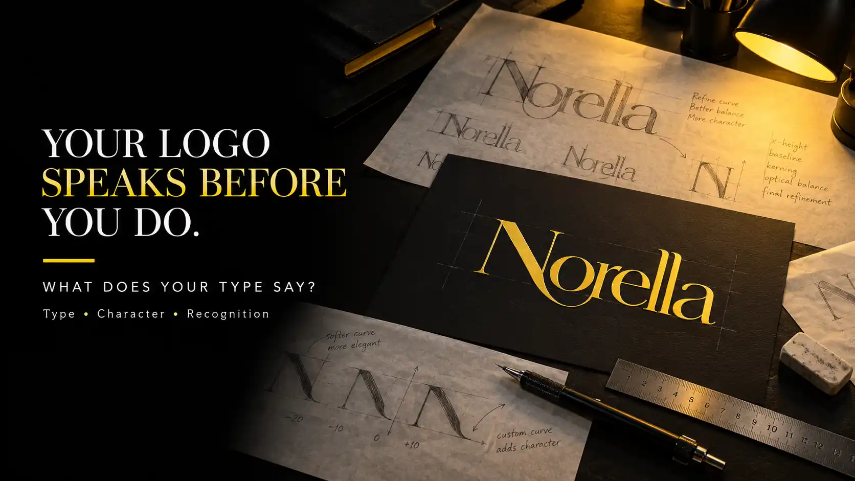
Designers Studio develops typography around the individual personality and communication requirements of each business.
Located in LB Nagar, Hyderabad, we work with startups, established businesses, manufacturers, retailers, product companies and service providers across Hyderabad and Telangana.
Our approach to Logo Typography for Businesses in Hyderabad considers personality, readability, spacing, proportions, scalability and practical applications.
The objective is to create typography that looks distinctive while remaining useful across the environments where customers actually encounter the brand.
Frequently Asked Questions
Which font is best for a business logo?
There is no single best font for every business logo. The appropriate typography depends on the brand personality, company name, audience, positioning and practical applications.
Should a logo use a serif or sans serif font?
Both serif and sans serif typography can work effectively. The decision should be based on the specific typeface, brand personality, readability and identity concept rather than the category alone.
Can a font be modified for a company logo?
Yes, subject to the relevant font licensing terms. Designers can modify suitable letterforms, spacing and proportions to create more distinctive logo typography when appropriate.
Why is kerning important in a logo?
Kerning adjusts the visual space between individual letter pairs. Careful kerning can improve balance, readability and the overall professional appearance of a wordmark.
Does Designers Studio create custom logo typography in Hyderabad?
Yes. Depending on project requirements, Designers Studio can develop customised typography, modified letterforms, wordmarks and complete visual identity systems for businesses across Hyderabad and Telangana.
Conclusion
Typography can transform a company name from ordinary text into a recognisable part of the brand. Typeface selection, customisation, kerning, readability, proportions and application testing all contribute to the final result.
Understanding Logo Typography for Businesses in Hyderabad helps businesses choose letterforms based on their personality and communication requirements rather than simply selecting a popular font.
Designers Studio creates professional logo and brand identity systems for businesses across Hyderabad and Telangana with attention to typography, originality, scalability and practical long term use.
Your Business Name Is More Than Text. Make It Recognisable.
Choose Designers Studio for professional Typography Logo Design Hyderabad developed around your brand personality, audience and real world applications.
Designers Studio
LB Nagar, Hyderabad
Serving Hyderabad and Telangana
Phone: +91 6300 466 860
Email: info@designersstudio.co.in