12 Logo Design Mistakes Businesses in Hyderabad Should Avoid
12 Logo Design Mistakes Businesses in Hyderabad Should Avoid
A logo is often one of the first visual elements customers associate with a business. It appears on websites, social media profiles, packaging, advertisements, business cards, signage and other important communication materials. However, many companies make avoidable decisions during logo development that affect readability, recognition and consistency. Understanding common Logo Design Mistakes in Hyderabad can help startups and established businesses create identities that remain practical as they grow. At Designers Studio, we approach professional logo design through business understanding, visual research, typography, originality and real application requirements.
Why Do Logo Design Mistakes Matter?
A logo does not operate independently. It becomes part of almost every visual interaction between a business and its customers.
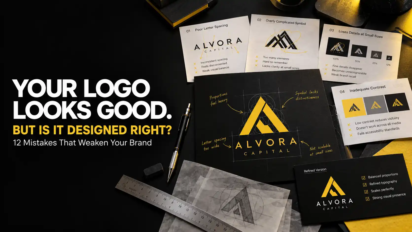
When the original identity contains weak typography, excessive detail or inconsistent proportions, those problems can appear repeatedly across websites, packaging, stationery and advertisements.
Correcting the identity later may require updating several business materials.
Professional Business Logo Design Hyderabad should therefore consider both immediate appearance and future applications.
The following twelve mistakes explain what businesses should examine before approving a new logo.
1. Designing a Logo Without Understanding the Business
One of the biggest mistakes is beginning with colors and symbols before understanding what the company represents.
A designer needs to understand the business model, audience, competitors, positioning and future plans.
For example, a premium property developer and an affordable residential service provider may operate in related markets but require different visual personalities.
A logo should communicate the intended positioning rather than simply reflect the personal preferences of the business owner.
How to Avoid This Mistake
Prepare a clear business brief before starting the design process. Explain your services, customers, competitors and the characteristics you want the brand to communicate.
2. Using Generic Logo Templates
Ready made logo templates can appear convenient, especially when a business wants to launch quickly.
However, commonly available symbols may also be used by unrelated companies.
Generic buildings, leaves, arrows, shields and letter combinations can make different businesses look unnecessarily similar.
Custom Logo Design Hyderabad should explore distinctive typography, original geometry, relevant symbolism or carefully constructed letterforms.
How to Avoid This Mistake
Review competing identities and develop concepts that reflect your individual business rather than relying entirely on familiar industry icons.
3. Making the Logo Too Complicated
Some businesses try to include every product, service and business value inside one logo.
This can result in several icons, excessive decorative elements, complicated illustrations and unnecessary text.
The problem becomes more noticeable when the identity is reduced for mobile screens or small printed applications.
A logo does not need to explain the complete business.
How to Avoid This Mistake
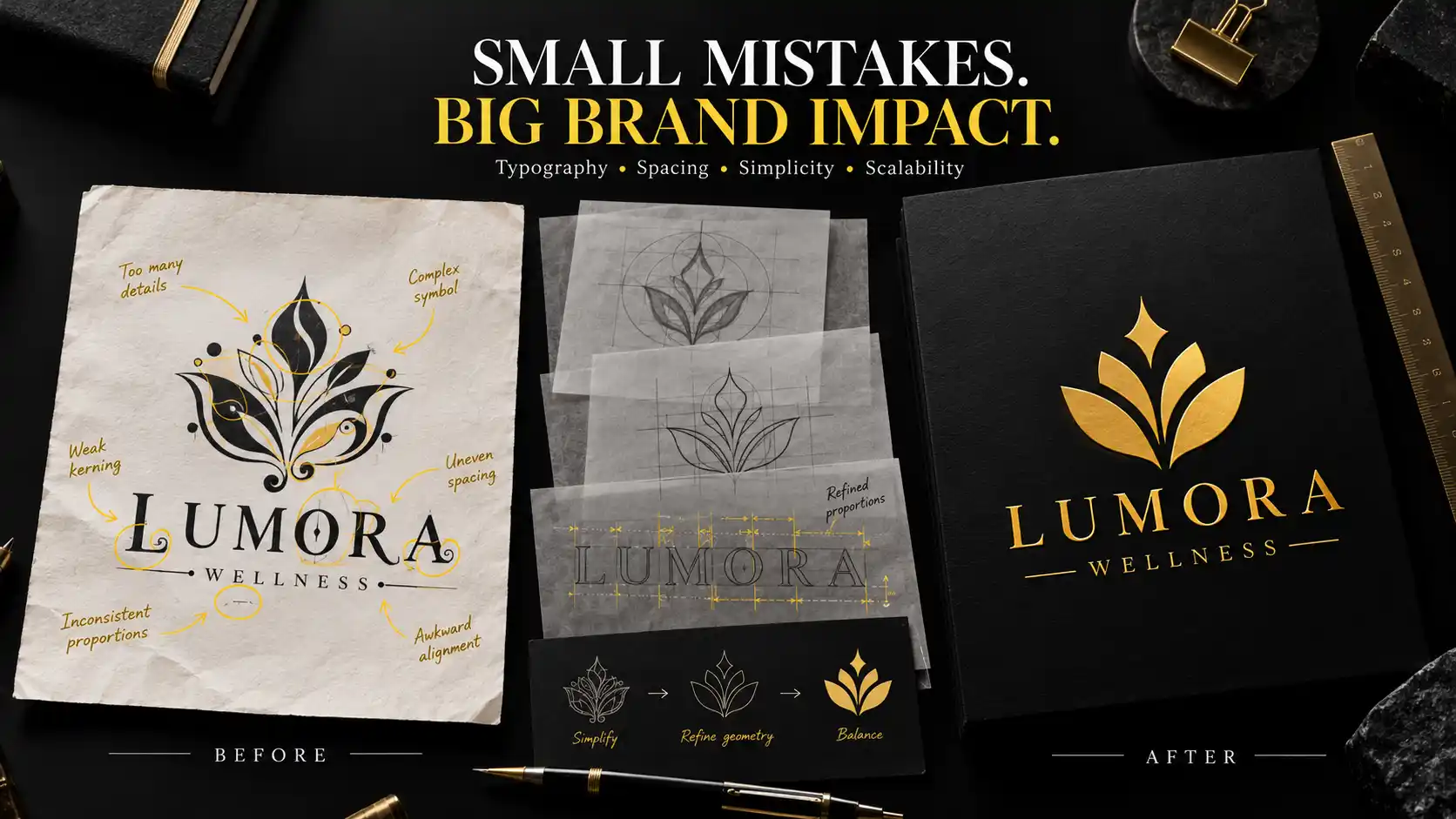
Identify the strongest visual idea and remove elements that do not contribute to recognition. Simplicity should support clarity without eliminating meaningful character.
4. Following Logo Design Trends Blindly
Design trends can provide inspiration, but they should not become the primary reason for selecting a logo direction.
Popular effects, decorative gradients and fashionable typography may not remain relevant indefinitely.
A business that changes its identity repeatedly to follow trends can also create unnecessary inconsistency.
How to Avoid This Mistake
Prioritise strong typography, balanced proportions, appropriate symbolism and practical usability. Use contemporary design techniques when they genuinely support the identity.
5. Choosing the Wrong Typography
Typography communicates personality even before customers consciously evaluate the letters.
An unsuitable font can make a professional business appear informal or create a visual tone that conflicts with its intended audience.
Poor kerning, inconsistent letter spacing and distorted proportions can also reduce the quality of an otherwise promising identity.
Professional Logo Design Hyderabad should treat typography as a central design decision.
How to Avoid This Mistake
Evaluate typefaces according to brand personality, readability and applications. Refine spacing and individual letterforms where appropriate.
6. Selecting Logo Colors Without Strategy
Choosing colors only because they are personally attractive can create a mismatch between the identity and the intended market.
Color associations vary according to audience, culture, industry and surrounding visual elements.
Using too many colors can also make an identity difficult to reproduce consistently.
How to Avoid This Mistake
Develop a controlled palette based on positioning, differentiation and practical applications. Test the logo in monochrome as well as its approved brand colors.
7. Ignoring Logo Scalability
A logo may look impressive on a large presentation screen but become unreadable when reduced.
Small text, delicate lines and intricate illustrations can disappear on business cards, social media profiles or application icons.
Scalability is therefore an essential part of professional identity development.
How to Avoid This Mistake
Test the logo at several sizes. Consider whether compact or simplified configurations are necessary for smaller applications.
8. Using Poor Spacing and Proportions
Professional logo design requires careful attention to relationships between visual elements.
A symbol may appear disconnected when placed too far from the company name. Typography may feel crowded when letter spacing is inconsistent.
Even technically equal measurements do not always create visually balanced results.
How to Avoid This Mistake
Review the logo using alignment guides, proportion studies and optical adjustments. Evaluate the composition both with and without construction guides.
9. Depending Only on JPG or PNG Logo Files
Some businesses receive only a small JPG or PNG after completing a logo project.
These formats can be useful for everyday digital applications, but they are not always sufficient for professional production.
Enlarging a low resolution raster image can produce visible pixelation.
Vector artwork is particularly useful for signage, packaging, printing and other applications requiring flexible scaling.
How to Avoid This Mistake
Confirm the required deliverables before starting the project. Suitable vector formats may include SVG, EPS, AI or PDF, depending on the agreed scope.
10. Ignoring Real Brand Applications
A logo should not be approved only because it looks attractive on a presentation board.
It needs to function in the environments where customers will actually encounter the business.
These may include websites, brochures, product labels, uniforms, vehicles, packaging, signage and social media.
Different applications create different requirements for size, contrast, material and reproduction.
How to Avoid This Mistake
Test the identity on realistic applications before final approval. Use these tests to identify potential production and readability problems.
11. Creating Too Many Inconsistent Logo Versions
Businesses sometimes allow employees, printers and marketing agencies to modify the logo whenever a different format is required.
Over time, colors, proportions, typography and spacing may begin to vary.
This can weaken the visual consistency of the brand.
How to Avoid This Mistake
Create approved primary, secondary, monochrome and compact configurations where necessary. Document their correct usage through basic brand guidelines.
12. Ignoring Originality, Licensing and Usage Rights
A logo may contain fonts, illustrations or graphic elements obtained from external sources.
Businesses should understand whether those assets are licensed appropriately for their intended commercial use.
They should also avoid assuming that receiving a logo file automatically guarantees exclusive rights or trademark registration.
Originality checks and legal considerations become particularly important when the business plans to expand.
How to Avoid This Mistake
Clarify asset licensing, ownership and deliverables in the project agreement. Where necessary, obtain appropriate trademark advice before investing heavily in the identity.
Professional Logo Design Checklist for Business Owners
Before approving a logo, evaluate whether it represents the business accurately and communicates the intended personality.
Check that the symbol and typography are distinctive enough for the competitive environment.
Confirm that the company name remains readable at practical sizes.
Review spacing, proportions, alignment and color consistency.
Test the logo on both light and dark backgrounds.
Evaluate its appearance on websites, mobile screens, social media profiles, business cards and other relevant materials.
Confirm that appropriate professional artwork and approved logo variations will be delivered.
Finally, make sure the business understands how the identity should be used consistently.
For additional guidance, read our article on what makes a good logo.
How Designers Studio Helps Businesses Avoid Logo Design Mistakes
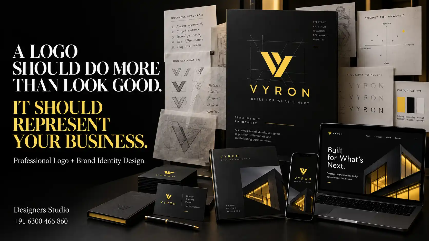
At Designers Studio, professional logo development begins with understanding the individual requirements of the business.
Business Discovery
We review the company, audience, positioning and future communication requirements.
Competitor Research
Relevant industry identities are studied to understand common visual patterns and opportunities for differentiation.
Concept Exploration
Suitable typography, symbols, monograms and abstract concepts are explored according to the business brief.
Typography Refinement
Letter spacing, proportions and relationships between visual elements are reviewed.
Color Development
Color directions are evaluated according to positioning, contrast and practical applications.
Scalability Testing
Promising concepts are reviewed at different sizes and across relevant backgrounds.
Application Review
The identity is evaluated on suitable digital and physical brand materials.
Final Artwork Preparation
Approved configurations are prepared in appropriate formats according to the project scope.
Businesses can also combine logo development with graphic designing services in Hyderabad, company profiles, packaging, website design and brochure design and printing services.
Why Choose Designers Studio for Professional Logo Design in Hyderabad?
Designers Studio creates professional visual identities for startups, established companies, manufacturers, retailers, healthcare businesses, real estate companies and service providers.
Based in LB Nagar, Hyderabad, we understand the importance of developing identities that can work across digital communication, business stationery, packaging and promotional materials.
Our approach to Logo Design Mistakes in Hyderabad focuses on preventing common design problems through business understanding, concept development, typography refinement and practical testing.
The objective is to create an identity that remains clear, distinctive and suitable for the company’s communication requirements.
Frequently Asked Questions
What are the most common logo design mistakes?
Common mistakes include generic symbols, excessive complexity, poor typography, unsuitable colors, weak scalability, inconsistent proportions and failing to test the logo across real applications.
Why should businesses avoid generic logo templates?
Generic templates may resemble identities used by unrelated companies. Custom design provides opportunities to develop typography, symbols and visual characteristics that better represent the individual business.
How can I tell whether my logo is professionally designed?
Evaluate originality, typography, spacing, readability, scalability, color consistency and performance across real digital and printed applications.
Can an existing business logo be improved without complete replacement?
Yes. Many logos can be improved through typography refinement, simplified geometry, better spacing, color adjustments and professional artwork preparation while retaining recognisable elements.
Does Designers Studio provide professional logo design in Hyderabad?
Yes. Designers Studio provides professional logo and visual identity design services for startups, established businesses and growing companies across Hyderabad and Telangana.
Conclusion
A professional logo requires more than an attractive symbol or fashionable typography. Business understanding, originality, spacing, readability, scalability and practical applications all contribute to an effective identity.
Understanding common Logo Design Mistakes in Hyderabad helps businesses make better decisions before investing in a new logo or redesigning an existing one.
Designers Studio develops professional logo identities for businesses across Hyderabad and Telangana with attention to visual clarity, originality, consistency and practical long term use.
Your Business Deserves More Than an Ordinary Logo.
Choose Designers Studio for professional
Custom Logo Design Hyderabad
developed around your business, audience and future branding requirements.
Designers Studio
LB Nagar, Hyderabad
Serving Hyderabad and Telangana
Phone:
+91 6300 466 860
Email:
info@designersstudio.co.in