
Logo Color Psychology for Businesses in Hyderabad
How to Choose the Right Brand Colors
Color is often one of the first characteristics people notice in a visual identity. It can influence attention, recognition, contrast and the overall personality customers associate with a business. However, choosing a logo color should involve more than selecting a favorite shade or following what competitors are using. Understanding Logo Color Psychology for Businesses in Hyderabad can help companies develop a more purposeful visual identity based on their audience, positioning, industry and practical communication requirements. Designers Studio creates professional logo and brand identity systems for startups, established companies, manufacturers, retailers, real estate businesses, healthcare organisations, restaurants and service providers across Hyderabad and Telangana.
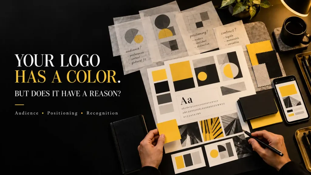
Why Does Logo Color Matter?
Color contributes to the overall impression created by a logo, but it does not work independently.
Typography, shape, spacing, imagery and context all influence how customers interpret an identity.
A strong color can help distinguish a business from competitors and create consistency across websites, packaging, social media, signage and print.
At the same time, an attractive color cannot rescue an unclear logo concept or weak typography.
Logo Colors Hyderabad should therefore be considered as part of a complete identity rather than as an isolated decorative decision.
The goal is to develop a palette that supports recognition while remaining practical across the environments where the business communicates.
What Is Color Psychology in Branding?
Color psychology explores how people may respond to or associate different meanings with colors.
In branding, these associations can help designers evaluate whether a palette supports the personality a business wants to communicate.
However, color meaning is not universal or guaranteed.
The same color can communicate different ideas depending on culture, industry, shade, saturation, surrounding colors and visual context.
For this reason, professional branding should avoid treating color psychology as a rigid formula.
Brand Color Psychology Hyderabad is most useful when combined with audience research, competitive analysis and practical application testing.
1. Red in Logo Design
Red is visually strong and can create immediate attention.
Depending on the shade and context, it can suggest energy, urgency, confidence, passion, power or warmth.
Bright red can feel energetic and highly visible, while deeper red tones can create a more mature or premium impression.
Red may be useful for brands that want a strong visual presence, but excessive use can become overwhelming.
Designers should also evaluate how the selected red behaves on screens, printed materials and different backgrounds.
2. Blue in Logo Design
Blue is frequently used across corporate, technology, healthcare and professional service categories.
Depending on its treatment, it can communicate calmness, professionalism, stability or technical precision.
Dark navy can create a more established corporate impression, while brighter blues may feel more contemporary and digital.
Because blue is common across many industries, simply selecting blue does not automatically make an identity professional.
Typography, symbol design and the exact shade still need to create sufficient distinction.
3. Yellow in Logo Design
Yellow is highly visible and can communicate optimism, energy, warmth and creativity.
It can work particularly well as an accent against dark backgrounds because of the strong contrast it can create.
Bright yellow requires careful control. Large areas can become visually intense, while small yellow details may create effective focal points.
The surrounding palette also changes its personality.
Yellow combined with black can feel bold and confident, while yellow with softer neutrals can create a lighter and more approachable impression.
Professional Logo Design Hyderabad should consider these relationships rather than evaluating one color independently.
4. Green in Logo Design
Green is frequently associated with nature, freshness, growth and wellbeing.
This makes it common in environmental, agricultural, healthcare, wellness and organic product categories.
However, green is not limited to these industries.
Darker greens can feel established and sophisticated, while brighter greens can appear energetic and contemporary.
Businesses operating in categories where green is extremely common may need stronger typography or a distinctive supporting palette to avoid blending into competitors.
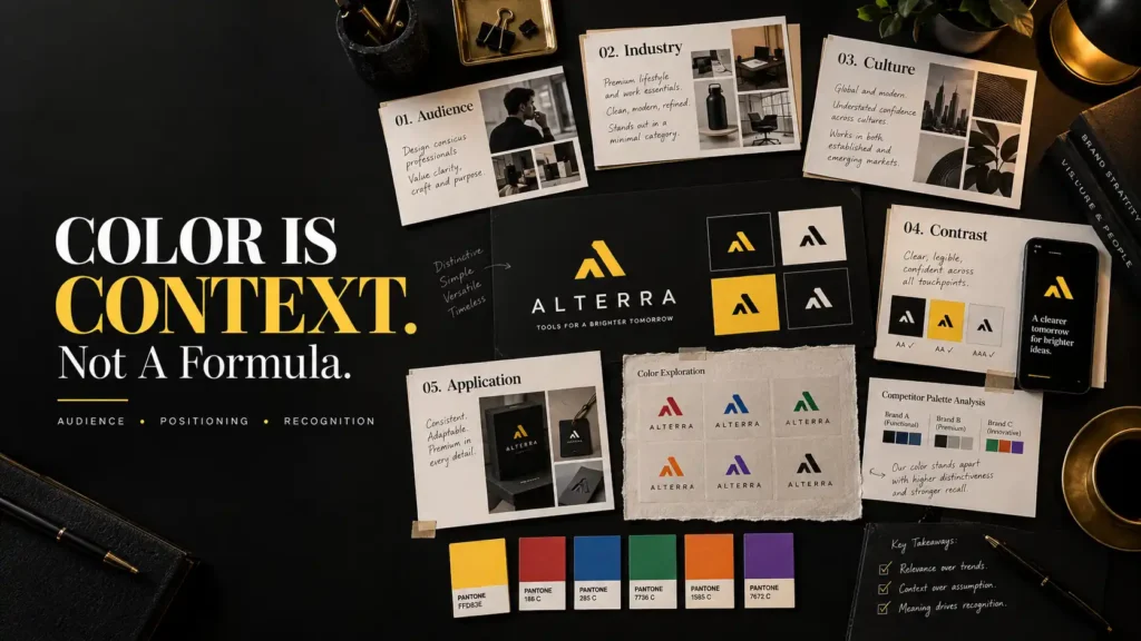
5. Orange in Logo Design
Orange combines some of the visual energy of red with the warmth of yellow.
It can feel friendly, active, accessible or youthful depending on the shade and execution.
Orange can work well when a brand wants energy without using a conventional bright red.
Deeper burnt orange tones can create a more mature character, while saturated orange can become highly energetic.
As with every strong color, sufficient contrast and controlled usage are important.
6. Purple in Logo Design
Purple can communicate very different personalities depending on the selected tone.
Deep purple may feel sophisticated, distinctive or luxurious, while brighter purple can create a more expressive or contemporary identity.
It is sometimes used by beauty, creative, technology, wellness and premium brands, although no industry owns a particular color.
The most important question is whether the selected shade supports the intended positioning and differentiates the company within its competitive environment.
7. Black in Logo Design
Black can create a strong sense of confidence, simplicity and sophistication.
It is especially effective when typography, geometry and spacing are important parts of the identity.
Black can support premium positioning, but the result depends heavily on execution.
A poorly designed black logo does not automatically become luxurious simply because the palette is minimal.
Black is also useful as a practical identity color because it can reproduce effectively across many applications.
A strong logo should generally remain understandable when reproduced in a single color, even when the primary identity uses a broader palette.
8. White and Neutral Colors in Brand Identity
White is often less noticeable as a brand color because it frequently functions as space rather than a printed element.
However, white and neutral tones can significantly influence how premium, minimal or spacious an identity feels.
Warm ivory can create a different character from pure white. Charcoal can feel softer than absolute black. Cool grey can support a technical visual system.
Neutral colors are especially useful for balancing stronger primary colors.
They provide visual breathing room and allow important accents to receive more attention.
How to Choose Logo Color Combinations
A professional brand does not necessarily need many colors.
In many cases, one strong primary color supported by neutrals can create a more recognisable identity than a large uncontrolled palette.
When several colors are used, each should have a clear role.
A primary color may dominate the identity. A secondary color can support specific applications. An accent color may highlight important information or calls to action.
Contrast should also be tested carefully.
Text and important information need sufficient readability against their backgrounds, particularly on websites and digital interfaces.
Brand Identity Design Hyderabad should create a color system that remains visually distinctive while being practical for everyday use.
Should Your Industry Determine Your Logo Color?
Industry conventions can provide useful context, but they should not become automatic rules.
If most businesses in a category use blue, choosing blue may help the identity feel familiar but can also make differentiation more difficult.
Choosing a completely unexpected color may create distinction but could communicate the wrong personality if it is not handled carefully.
Competitor analysis helps identify the visual landscape before a palette is selected.
The objective is to understand category expectations and then decide whether the business should align with them, reinterpret them or deliberately move away from them.
Color, Audience and Cultural Context
Color associations can vary between audiences and cultural contexts.
This becomes important for businesses communicating across regions or international markets.
A color associated with celebration in one context may carry a different meaning elsewhere.
Businesses should therefore avoid assuming that one universal psychological definition applies to every customer.
Audience understanding, market context and actual brand communication should guide the decision.
This is particularly important when colors are connected to religious, ceremonial or culturally significant uses.
Test Brand Colors Across Real Applications
A palette should not be approved only because it looks attractive on a logo presentation page.
Colors need to work across the actual environments where customers will encounter the business.
These may include websites, mobile screens, social media, brochures, business cards, packaging, uniforms, signage and vehicles.
Screen colors and printed colors can also behave differently.
A bright digital color may not reproduce identically through every print process or material.
Testing important applications early can identify these issues before the complete identity is implemented.
Build a Complete Brand Color System, Not Just a Logo Color
The color used inside the logo is only one part of the visual identity.
A complete system may define primary colors, secondary colors, accent colors and neutrals.
It can also explain which combinations are appropriate and how colors should be distributed across communication.
For example, a bright primary color may work effectively for buttons, headlines or graphic details but become visually overwhelming when used as the background of every page.
Brand guidelines can document suitable HEX and RGB values for digital use and relevant print specifications where required.
This helps designers, developers, printers and marketing teams reproduce the identity more consistently.
Common Logo Color Mistakes Businesses Should Avoid
One common mistake is choosing colors only because the business owner personally likes them.
The identity needs to communicate with customers, not only reflect individual preference.
Another mistake is copying the color palette of a major competitor.
This may make the new identity look familiar, but it can also reduce distinction.
Businesses should avoid using too many colors without a clear hierarchy.
Another problem is selecting colors only on a bright computer monitor without testing practical reproduction.
Poor contrast can make typography difficult to read, particularly on digital interfaces.
Businesses should also avoid relying on color alone to communicate meaning. The logo should remain understandable in monochrome where possible.
Finally, colors should not be changed frequently across campaigns simply because another combination looks attractive. Consistency helps build recognition.
Our Logo Color Selection Process at Designers Studio
Designers Studio approaches color as one part of the complete identity rather than selecting a palette in isolation.
Business Discovery
We understand the business, audience, positioning, personality and future requirements.
Competitive Review
We examine common color patterns within the category and identify opportunities for suitable differentiation.
Logo Development
The core identity is developed with attention to form, typography and recognition rather than depending entirely on color.
Palette Exploration
Relevant color directions are evaluated according to the intended personality and applications.
Contrast Testing
Important combinations are reviewed for clarity and practical usability.
Application Testing
The selected palette is evaluated across suitable digital and physical applications.
Brand Color Documentation
Where included in the project scope, approved colors and usage principles are organised for future designers, developers and marketing teams.
Businesses developing a complete identity can combine logo creation with graphic designing services in Hyderabad, brochure design and printing services in Hyderabad, company profiles, packaging, social media creatives and website design.
Frequently Asked Questions
What is color psychology in logo design?
Color psychology considers how people may associate different characteristics or emotions with colors. In professional logo design, these associations should be evaluated alongside audience, culture, industry, contrast and practical applications rather than treated as fixed rules.
Which color is best for a business logo?
There is no single best logo color for every business. The appropriate palette depends on the company’s positioning, audience, competitive environment, personality and where the identity needs to be used.
How many colors should a logo have?
A logo does not need a specific number of colors. Many effective identities use a limited palette. The important consideration is whether every color has a clear purpose and whether the logo remains practical across different applications.
Should my logo use the same colors as competitors?
Competitor colors can help reveal category conventions, but copying them may reduce differentiation. The palette should support your own positioning while remaining appropriate for your audience and market.
Does Designers Studio create complete brand color systems?
Yes. Depending on project scope, Designers Studio can develop primary, secondary, accent and neutral brand colors alongside logo design, typography and wider visual identity guidelines for businesses across Hyderabad and Telangana.
Conclusion
Color can influence how a logo feels, but professional color selection should involve more than assigning a fixed emotion to a particular shade. Audience, positioning, culture, competitors, contrast and practical applications all influence whether a palette works effectively.
Understanding Logo Color Psychology for Businesses in Hyderabad can help companies make more purposeful decisions and build color systems that remain recognisable across websites, social media, packaging, print and signage.
Designers Studio creates professional logo and brand identity systems for businesses across Hyderabad and Telangana with attention to strategy, originality, color consistency and practical long term use.
Why Choose Designers Studio for Logo and Brand Color Design in Hyderabad?
Designers Studio develops brand colors around the personality and practical requirements of the business rather than applying the same palette to every industry.
Located in LB Nagar, Hyderabad, we work with startups, established businesses, manufacturers, retailers, product companies and service providers across Hyderabad and Telangana.
Our approach to Logo Color Psychology for Businesses in Hyderabad considers audience, positioning, competitive environment, contrast, scalability and real world applications.
The objective is to build a recognisable visual system in which color supports the identity rather than becoming the identity’s only distinctive feature.
Don’t Pick a Color Because You Like It. Choose One Your Brand Can Own.
Choose Designers Studio for professional Business Logo Design Hyderabad and brand color systems developed around your audience, positioning and real world communication.
Designers Studio
LB Nagar, Hyderabad
Serving Hyderabad and Telangana
Phone: +91 6300 466 860
Email: info@designersstudio.co.in