

Blueprint to Choose the Best Fonts for Logo Design
Best Fonts for Logo Design in Hyderabad: The Ultimate Typography Guide
Finding the best fonts for logo design in Hyderabad is the first critical step toward building a dominant and recognizable brand identity in a highly competitive market. When launching a new company or embarking on a comprehensive rebranding journey, business owners frequently pour their energy into color palettes and icon choices, often overlooking one of the most critical elements of their overall marketing strategy. That element is typography. The specific letters, curves, and angles you choose to represent your company speak volumes to your audience long before a potential customer even reads the actual words. If you are struggling to create a visual identity that resonates with your target demographic, identifying the best fonts for logo design in Hyderabad is a fundamental requirement for building a recognizable, trusted, and authoritative brand. Your company emblem needs to communicate absolute trust, unwavering professionalism, and deep industry expertise right from the very first glance.
With hundreds of thousands of digital typefaces available across the internet today, making the right choice can quickly feel overwhelming. A poor font choice can easily make a premium brand look cheap, or conversely, make a friendly neighborhood cafe seem overly corporate and unapproachable. This comprehensive, expert level educational resource will walk you meticulously through the essential principles of typography. By understanding the deep psychology of fonts and their practical applications across different mediums, you will be fully equipped to make an informed decision that perfectly aligns with your commercial goals. To truly leverage the best fonts for logo design in Hyderabad, you must understand how typography influences human behavior, shapes brand perception, and ultimately drives consumer purchasing decisions in the local market.
As Hyderabad continues its rapid transformation into a global technological and business hub, the sheer volume of new businesses entering the market is staggering. From the bustling tech corridors of HITEC City and Gachibowli to the premium retail avenues of Banjara Hills and Jubilee Hills, standing out requires more than just a good product. It requires a visual identity that captures attention and retains memory. The foundation of that visual identity relies heavily on text. In this guide, we will explore everything from classic serif classifications to modern geometric sans-serifs, providing you with actionable insights to elevate your corporate branding.
Why Choosing the Best Fonts for Logo Design in Hyderabad Matters
Typography is much more than just arranging letters on a digital page or a physical screen. It is the intricate art and technique of making written language legible, readable, and highly visually appealing. In the context of corporate branding, the font you select becomes the silent ambassador of your business operations. According to extensive research published by the American Institute of Graphic Arts (AIGA), visual design heavily influences consumer trust, with typography playing a leading role in how a core message is perceived by the general public.
When you invest in professional logo design, you ensure your typography is custom tailored to speak directly to your target audience. A well chosen typeface enhances character, conveys emotion, and sets expectations. For instance, a luxury real estate development firm in Banjara Hills will require a vastly different typographic approach compared to a fast paced, artificial intelligence startup operating in T-Hub. The font sets the atmospheric mood, establishes a clear visual hierarchy, and creates instant brand recognition that can last for decades.
In a bustling metropolis like ours, consumers are bombarded with thousands of marketing messages daily. Billboards on the Outer Ring Road, digital ads on smartphones, and storefront signs in local neighborhoods all compete for a fraction of a second of attention. Using the best fonts for logo design in Hyderabad ensures that in that split second, your brand communicates exactly what it stands for without causing cognitive friction for the viewer.
Key Statistics on Visual Branding and Typography
- Over 75 percent of modern consumers judge a company’s overall credibility based entirely on its visual design and website presentation.
- Consistent presentation of a brand including its strict typography guidelines has been seen to increase revenue by up to 33 percent over time.
- Strategic color and typography combinations can increase brand recognition and consumer recall by up to 80 percent.
- Logos that utilize highly legible, scalable fonts perform significantly better in digital marketing campaigns and mobile applications.
The Psychology of Typography in Local Markets
To master visual branding, one must first understand the psychology of type. Every font carries subconscious associations based on its historical usage, cultural significance, and physical shape. When searching for the best fonts for logo design in Hyderabad, you are essentially searching for a psychological trigger that aligns with your specific business values.
For example, fonts with sharp, angular edges typically convey power, speed, dynamism, and masculinity. These are often used by sports brands, automotive companies, and high intensity fitness centers. On the other hand, fonts with soft, rounded curves communicate friendliness, safety, comfort, and approachability. These are frequently utilized by pediatric clinics, organic food brands, and community driven social enterprises.
Furthermore, the spacing between the letters plays a massive role in psychological perception. Wide, airy spacing between uppercase letters suggests luxury, exclusivity, and premium quality. Tight, bold spacing suggests urgency, impact, and high value affordability. By manipulating these subtle typographic elements, designers can completely alter how the local demographic perceives a new business entering the market.
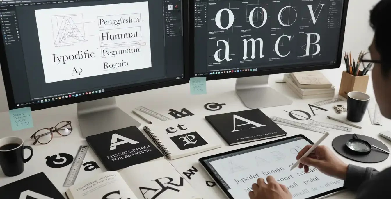
Core Font Categories Every Business Owner Should Know
Before diving into specific brand recommendations, it is absolutely crucial to understand the primary classifications of typefaces. Each major category carries its own historical context, structural rules, and psychological weight. When evaluating the best fonts for logo design in Hyderabad, understanding these classifications will help you narrow down your choices significantly and prevent costly rebranding mistakes down the line.
Serif Fonts
Serif fonts feature small decorative strokes, often referred to as feet, at the ends of the primary letterforms. They are the oldest style of typography in the western world and are universally associated with tradition, reliability, deep authority, and classic elegance. Law firms, financial institutions, private wealth managers, and esteemed academic organizations frequently use serif fonts to project a sense of established trust and longevity. Classic examples include Times New Roman, Garamond, Baskerville, and Georgia. If you want your business to project historical heritage and steadfast reliability, a serif font is ideal.
Sans-Serif Fonts
As the French name suggests, sans-serif fonts completely lack the small decorative strokes at the ends of characters. They offer exceptionally clean lines, smooth continuous curves, and a highly contemporary, forward looking feel. Sans-serif typefaces are celebrated worldwide for their maximum clarity and legibility, especially on modern digital screens. Technology companies, modern advertising agencies, and innovative retail brands heavily favor sans-serifs. Well known industry examples include Helvetica, Futura, Proxima Nova, and Montserrat.
Slab Serif Fonts
Slab serifs are a distinct subcategory of serif fonts characterized by thick, block like serifs. Instead of the delicate, tapering serifs found in traditional categories, slab serifs are bold, authoritative, and unapologetic. They originated during the industrial revolution for use in large advertising posters. Today, they are excellent for brands that want to communicate strength, durability, and ruggedness. Construction companies, outdoor equipment retailers, and industrial manufacturers often benefit greatly from slab serif typography.
Script Fonts
Script fonts are carefully designed to mimic the fluid, continuous strokes of natural human handwriting or elegant calligraphy. They range from highly formal, ornate designs used for wedding invitations to casual, relaxed brush strokes used for modern cafes. Because they are highly distinctive and unique, they are excellent for adding a highly personal touch or a profound sense of luxury to a brand. However, they must be used extremely sparingly as they can pose severe legibility issues when scaled down to small sizes, such as on printed business cards or tiny mobile phone screens.
Display Fonts
Display fonts are designed specifically for large impact headings and primary logos rather than long, continuous paragraphs of body text. They are highly stylized, wildly unique, and bursting with distinct personality. While they can make a brand stand out instantly in a crowded marketplace, they run a significant risk of becoming visually dated as global design trends shift. Careful, strategic consideration is required when choosing a display font to ensure it has long term viability.
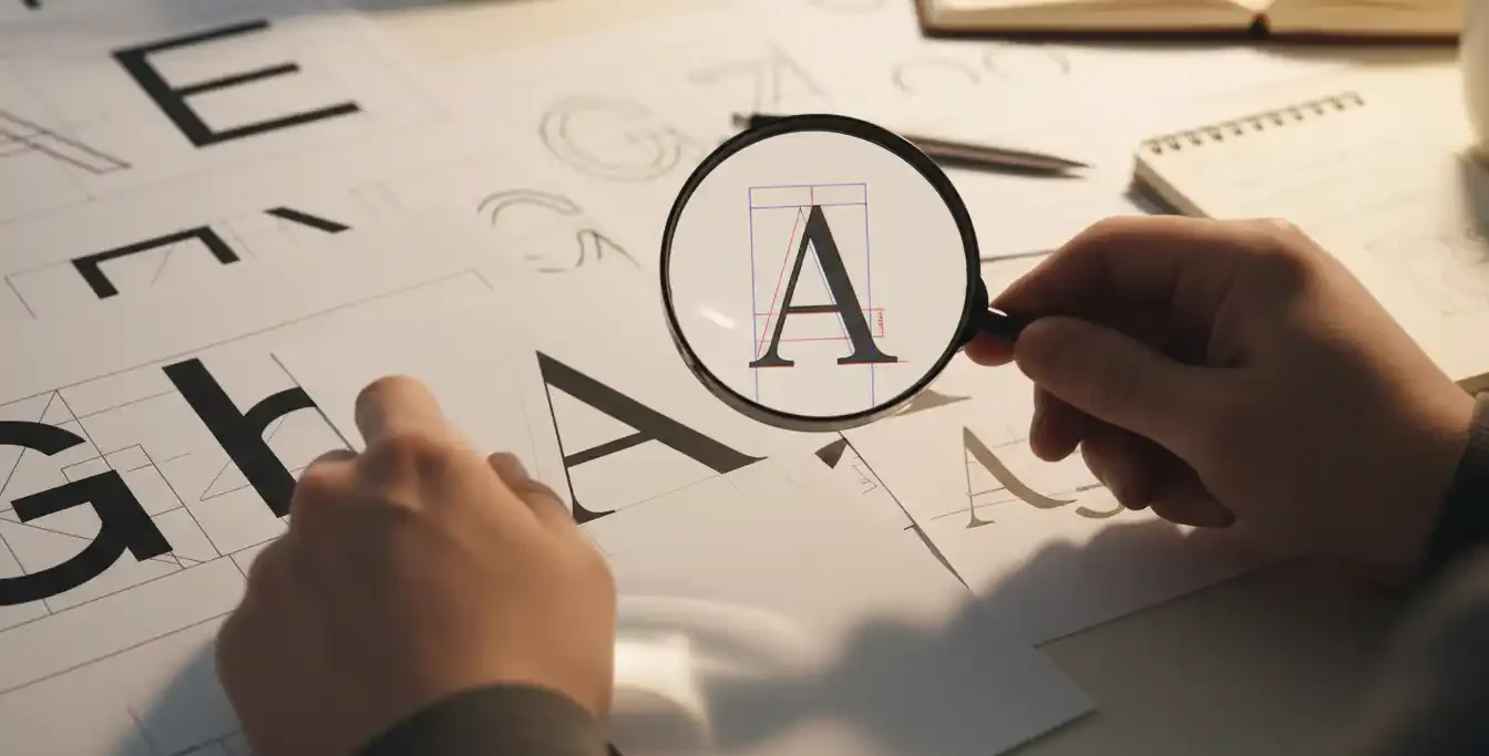
Understanding the Anatomy of Type
To truly participate in the selection process of the best fonts for logo design in Hyderabad, business owners should familiarize themselves with basic typographic anatomy. Communicating effectively with your design team requires a shared vocabulary. When a designer explains why a certain font works better than another, they will reference the physical structure of the letters.
The Baseline is the invisible line upon which most letters sit. The Cap Height refers to the height of a capital letter above the baseline. The X-height is the height of the lowercase letters, specifically the lowercase x, which determines how readable a font is at very small sizes. Fonts with a large x-height are generally much easier to read on digital screens, making them highly preferable for modern web based applications.
Additionally, understanding Ascenders and Descenders is vital. Ascenders are the parts of lowercase letters that extend above the x-height, such as in the letters b, d, and h. Descenders are the parts that drop below the baseline, such as in the letters p, q, and y. A logo design must carefully account for these extensions so they do not clash with other visual elements or taglines placed beneath the primary company name.
Selecting Professional Fonts for Startups
Hyderabad has rapidly grown into a massive international hub for technology, artificial intelligence, software development, and entrepreneurial ventures. With thousands of new companies launching every single year, standing out requires a highly strategic visual approach. When looking for professional logo design fonts for startups in Hyderabad, founders need to perfectly balance modern, innovative aesthetics with ultimate readability across all possible digital platforms.
Startups usually operate in digital spaces first and foremost. Therefore, the chosen font must render absolutely perfectly on a high resolution laptop screen, a compressed mobile phone application, and compressed social media profile pictures. Scalability is simply non negotiable in the modern digital landscape. A major, defining factor in finding the best fonts for logo design in Hyderabad for startups is this exact concept of digital scalability. Geometric sans-serif fonts are currently dominating the startup ecosystem precisely because they communicate forward thinking agility and technological prowess without sacrificing any clarity.
Furthermore, startups often pivot or expand their services rapidly. A highly restrictive, overly specific display font might box a startup into a niche they eventually outgrow. A clean, versatile sans-serif allows the brand to evolve seamlessly. Many of the most successful tech unicorns in the region utilize custom modified geometric fonts that feel simultaneously friendly and highly secure.
Practical Implementation Tips for Startup Founders
- Always test your chosen font in strict monochrome. If your logo design only works when color is applied, the underlying typography is not structurally strong enough.
- Check the font at a minimal 16 pixel height to accurately simulate a website browser favicon. The core letterforms must remain distinctly legible.
- Ensure there is a very clear visual distinction between similar characters, such as an uppercase I and a lowercase l, to prevent user confusion.
- Consider how the font pairs with your user interface fonts. The transition from logo to website text should feel like a cohesive digital experience.
Implementing Modern Typography for Branding
Modern branding initiatives go far beyond simply picking a single appealing font from a dropdown menu. True branding involves creating a highly cohesive typographic system that governs every visual aspect of the company. Searching for the best fonts for logo design in Hyderabad also means looking deeply at modern typography systems and analyzing how multiple fonts pair together harmoniously. Implementing modern typography for branding in Hyderabad requires a deep, technical understanding of advanced concepts like font pairing, kerning, tracking, and leading.
Kerning refers to the manual adjustment of spacing between two individual letters to create visually pleasing and balanced text. Certain letter combinations, like an uppercase A and an uppercase V, naturally create awkward white space that must be corrected. Tracking, on the other hand, refers to the uniform spacing applied across an entire word or sentence. Adjusting these specific spaces can completely alter the visual impact and perceived value of a logo.
For example, adding extensive extra tracking to a bold, heavy sans-serif font instantly creates a premium, high end aesthetic. Many luxury fashion brands, high end real estate developers, and premium automotive brands utilize this exact tracking technique to effortlessly elevate their market positioning and justify premium pricing models.
Additionally, modern branding demands extreme versatility. According to extensive documentation provided by Google Fonts Knowledge, selecting a comprehensive typeface family with multiple varying weights ranging from thin and light to bold and black provides maximum flexibility across widely different marketing channels. You will desperately need a consistent typographic feel whether you are printing a massive physical brochure design, wrapping a corporate vehicle, or running a targeted digital advertising campaign on social media.
Determining the Best Typeface for Corporate Identity
Massive corporate enterprises naturally have vastly different requirements than small, agile startups. They require robust typographic systems that can scale securely across hundreds of employees, dozens of different departments, and international borders. Corporate leaders who are actively looking for the best fonts for logo design in Hyderabad need to focus heavily on long term longevity over fleeting, short term design trends. When evaluating the best typeface for corporate identity design Hyderabad business leaders must prioritize absolute clarity, structural integrity, and international appeal.
A global corporate logo must project undeniable stability and unwavering permanence. Many large scale, multinational enterprises deliberately opt for transitional serifs or highly refined humanist sans-serifs. The ultimate goal is to confidently choose a font that will look just as relevant, professional, and trustworthy twenty years from now as it does today. Constant rebranding damages corporate equity and creates market confusion.
Furthermore, robust corporate identity involves extensive internal documentation, external signage, investor reports, and localized marketing materials. The primary logo font must pair exceptionally well with standard, universally available system fonts to ensure seamless internal communications. If a company logo utilizes a font that clashes horribly with Arial or Times New Roman, internal documents will look disjointed and unprofessional.
Consider the real world examples of massive multinational corporations successfully operating in the local market. Their primary corporate logos strictly avoid overly decorative, distracting elements, relying instead on strong, perfectly kerned, highly legible typography that immediately commands respect and authority across all consumer touchpoints. Even critical local marketing efforts like Google My Business Optimization are heavily, directly impacted by how clearly and cleanly your branded logo is displayed in local search panels, maps, and directory listings.

Common Typography Mistakes to Avoid
Even with the best intentions, businesses frequently make critical errors when selecting their primary typography. Knowing what to avoid is just as important as knowing what to select. To ensure you are truly utilizing the best fonts for logo design in Hyderabad, you must actively audit your design concepts for these common pitfalls.
First, utilizing too many fonts is a catastrophic error. A logo should almost never contain more than two distinct fonts. One font serves as the primary brand name, and a secondary, simpler font serves as the tagline or descriptor. Introducing a third font creates immense visual clutter, destroys visual hierarchy, and makes the brand look amateurish and uncoordinated.
Second, ignoring typographic contrast ruins legibility. If your primary font is a thick, bold sans-serif, your secondary tagline font should be noticeably thinner or utilize a different classification entirely to create visual interest. If both fonts are too similar in weight and style, they will bleed together visually, completely defeating the purpose of having a secondary font in the first place.
Third, aggressively following short lived design trends will force a premature rebrand. What looks highly trendy on creative design portfolios today might look incredibly outdated in just two years. Your logo font must stand the test of time. It is always safer to lean toward classic typographic proportions rather than exaggerated, stylized trend fonts.
Custom Logo Font Selection Guide
To fundamentally simplify this deeply complex process, our agency has developed a comprehensive custom logo font selection guide for Hyderabad businesses. By meticulously following these structured, logical steps, you can entirely eliminate emotional guesswork and confidently pinpoint the very best fonts for logo design in Hyderabad that align perfectly with your data driven design decisions and overall business strategy.
Step 1: Define Your Core Brand Archetype
Are you the innovative Creator, the nurturing Caregiver, the authoritative Ruler, or the disruptive Rebel? Take the time to write down exactly five precise adjectives that perfectly describe your company culture. If your chosen words are friendly, accessible, warm, and affordable, lean heavily toward rounded, open sans-serif fonts. If your descriptive words are exclusive, premium, established, and traditional, you must explore elegant, high contrast serif typefaces.
Step 2: Deep Dive Analysis of Local Competitors
Look critically at five highly successful competitors currently operating within your local industry sector. Carefully note the exact font categories and weights they use. Your goal here is absolutely not to copy them, but rather to understand the established industry standard and consumer expectation. You must make a strategic decision whether you want to blend in visually to meet established customer expectations or completely break the mold to stand out as a disruptive alternative.
Step 3: Evaluate Cross Platform Legibility
Once you have selected a potential typeface, put it through a rigorous stress test. Print it out on a standard piece of paper at very small sizes. View it on the highest resolution monitor you own, and then view it on an older, lower resolution mobile device. Does the letter ‘e’ suddenly look like a solid black circle? Do the letters ‘r’ and ‘n’ merge to look like an ‘m’? If the font fails these basic legibility tests, it must be discarded immediately, regardless of how beautiful it looks at a massive size.
Step 4: Customization is the Key to Uniqueness
The ultimate secret to a truly unique, memorable logo is professional customization. A highly skilled designer will take a high quality, commercially licensed base font and manually modify specific letterforms. They might slightly extend a tail, seamlessly connect two letters into a custom ligature, or cut a sharp, distinct angle into a vertical stem. This critical process completely transforms a standard, widely available font into a proprietary visual asset that cannot be easily replicated by competitors.
Step 5: Establishing the Typographic Hierarchy
If your logo includes a tagline, you must establish a clear hierarchy. The primary brand name must unequivocally be the most dominant visual element. The tagline should utilize a complementary typeface that is highly readable but completely subordinate to the main title. This is often achieved by using a lighter weight of the same font family, or by pairing a highly distinctive primary font with a neutral, geometric sans-serif.
Step 6: Finalizing the Vector Format
Once the absolute best font has been selected and heavily customized, the final logo must be formally converted into raw vector outlines. This means the design is no longer technically a readable text font that requires the file to be installed on a computer, but rather a series of mathematical shapes. This absolutely guarantees that your logo will display flawlessly and exactly as intended on any device, anywhere in the world, regardless of whether the user has your specific font installed locally.
Understanding Font Licensing and Legalities
One of the most dangerous mistakes a growing business can make is ignoring font licensing laws. Never arbitrarily assume a beautiful font you downloaded freely from the internet is legally cleared for commercial business use. Always purchase the correct, legally binding commercial license for your primary logo typeface.
Many free font websites offer typefaces strictly for personal use only. If you use a personal use font to generate revenue, create corporate branding, or print marketing materials, you are directly violating international copyright laws. Type foundries actively police the internet using advanced image recognition software to find unlicensed use of their intellectual property. Using unlicensed typography can result in severe legal penalties, massive retroactive licensing fees, and forced rebranding campaigns that can entirely cripple a growing business.
When procuring the best fonts for logo design in Hyderabad, consult reputable sources like Adobe Fonts or highly respected independent type foundries. Ensure you acquire a desktop license for creating the logo, and if you plan to use the exact same font as live text on your corporate website, you must also purchase the appropriate webfont license, which is often based on your monthly website traffic.
Typography Trends Shaping the Market in 2026
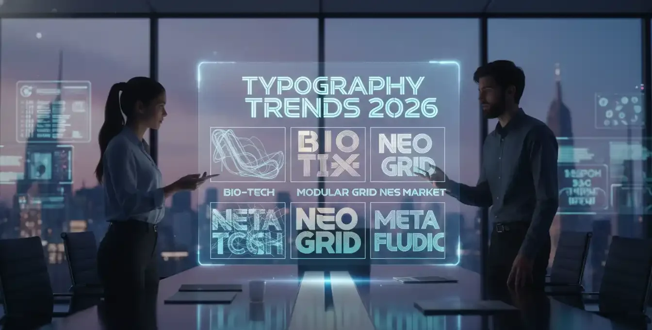
While classic typography remains timeless, the visual landscape is constantly evolving. Staying aware of current trends can help your brand feel contemporary and relevant. In recent years, we have seen a massive shift away from the overly minimal, sterile sans-serifs that dominated the previous decade. Today, brands are desperately seeking more personality and warmth.
One major trend is the return of high contrast serif fonts. These typefaces feature very thick vertical stems combined with razor thin horizontal strokes, creating a highly dramatic, luxurious aesthetic. They are exceptionally popular in the fashion, lifestyle, and premium hospitality sectors in Hyderabad.
Another significant advancement is the widespread adoption of variable fonts. This revolutionary technology allows a single font file to behave like multiple fonts, enabling designers to adjust the exact weight, width, and slant of the letters fluidly rather than being restricted to predefined bold or italic options. This allows for unprecedented customization when crafting a unique corporate mark, heavily influencing how agencies search for the best fonts for logo design in Hyderabad.
Finally, custom typography is becoming more accessible. Instead of licensing existing fonts, many ambitious companies are commissioning entirely bespoke typefaces designed exclusively for their organization. This guarantees absolute brand uniqueness and completely eliminates complex ongoing licensing fees across massive global organizations.
Frequently Asked Questions
How many fonts should I use in my logo design?
What is the technical difference between a typeface and a font?
Should I use completely free open-source fonts for my commercial business logo?
Why does my logo font frequently look blurry or pixelated on social media platforms?
Conclusion
Choosing the perfect typography is not merely an aesthetic preference; it is a foundational, highly strategic step in building a lasting, profitable commercial identity. The exact letters representing your business carry immense psychological power and directly dictate how your audience perceives your overall value in the marketplace. From deeply understanding the subtle differences between authoritative traditional serifs and highly modern sans-serifs, to systematically ensuring perfect legibility across all rapidly evolving digital platforms, typography requires intensive strategic planning and flawless professional execution.
By carefully applying the advanced principles, methodologies, and technical insights discussed in this comprehensive guide, local business owners can dramatically elevate their visual presence, build immediate, unwavering consumer trust, and set themselves distinctively apart in a highly competitive, rapidly growing regional market. Ultimately, taking the time to discover and implement the best fonts for logo design in Hyderabad is a crucial, foundational step toward securing your company’s long term market dominance and lasting financial success.
Ready to Elevate Your Brand with the Perfect Custom Logo?
A truly powerful visual identity starts with expert typography and flawless execution. Stop guessing with your brand’s future. Partner with our highly experienced creative team to design a memorable, legally protected brand identity that captures your unique vision and aggressively dominates your local industry.
- 📞 Phone: +91 6300 466 860
- 📧 Email: info@designersstudio.co.in
- 📍 Location: LB Nagar, Hyderabad
